11 October 1997
Source:
http://www.theatlantic.com/atlantic/issues/97oct/archit.htm
See Herbert Muschamp on this topic: http://jya.com/remoma.htm
The Atlantic Monthly, October, 1997
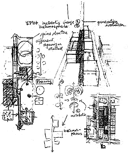
From the submission by Rem Koolhaas
ART museums have become the chief patrons of trendsetting
architecture. The openings of new museums such as the Getty Center, in Los
Angeles, designed by Richard Meier, and the Guggenheim in Bilbao, Spain,
designed by Frank Gehry, are anticipated with the same sense of excitement
that attends the openings of Steven Spielberg blockbusters. The anticipation
is explained in part by art's quasi-religious status in modern society and
in part by plain showmanship, resulting from the need of museums to increase
attendance. Thus after the Museum of Modern Art, in New York, announced last
year that it was going to undertake a major expansion, Herbert Muschamp,
of The New York Times, described the commission as "one of the most
prestigious plums that is likely to fall into any architect's lap within
this decade."
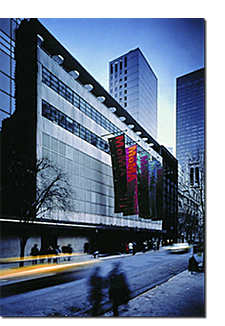
The Museum of Modern Art has always seen itself as being in the vanguard
of progressive architecture and design. In 1932, only three years after it
was founded, the museum mounted an exhibition titled "Modern Architecture:
International Exhibition." The show, which popularized the term "International
Style," introduced the American public to European modernists such as Ludwig
Mies van der Rohe and Walter Gropius. The idiom of Bauhaus modernism --
free-flowing spaces with movable white walls, contained in a functional box
-- was incorporated into the Modern's new building, on West 53rd Street.
That was 1939. Today modernism has joined the mainstream. Home-furnishings
chains like IKEA and Crate & Barrel have brought modern design to the
mass market. As for the avant garde, well, many upscale clothing boutiques
now outmodern the Modern. Being overtaken by Giorgio Armani and Calvin Klein
might cause a museum to worry -- which probably explains why the Modern announced
that its expansion would also involve a substantial redesign.
Breaking with tradition, the Modern decided to hold a design competition,
and it invited ten architects to enter. Neither Gehry nor Meier was on the
list. Nor
 |
| The Modern today |
were other prominent museum architects, such as I. M. Pei, who was responsible
for the expansion of the Louvre; Robert Venturi, who won the international
competition for the Sainsbury Wing of the National Gallery in London; Renzo
Piano, the architect of the highly praised Menil Collection, in Houston;
and Moshe Safdie, whose National Gallery of Canada is a superb art museum.
The trustees picked instead a group of modernists who are relative newcomers
-- mostly in their late forties and early fifties, which is young for an
architect. One could say that the trustees passed up blue chips to put their
money on small-cap stocks. Architecture, like the stock market, is international,
and the list included Yoshio Taniguchi and Toyo Ito, from Japan; Rem Koolhaas
and Wiel Arets, from Holland; Dominique Perrault, a Frenchman; the team of
Jacques Herzog and Pierre de Meuron, from Switzerland; and, from New York,
Bernard Tschumi, Steven Holl, Rafael Viñoly, and Tod Williams and
Billie Tsien.
THIS is hardly a representative sample of contemporary
practitioners. The absence of a canonic classicist such as Allan Greenberg
or John Blatteau is understandable, given the museum's roots -- although
both these architects would be likely to argue that their buildings are as
modern as anyone else's. Certainly, though, the net could have been cast
wider. Some of the most interesting buildings today are the work of architects,
such as Aldo Rossi in Europe, and Thomas Beeby and William Rawn in this country,
who are exploring the blurred edges between modernism and pre-modern
architectural traditions. The buildings of John Ruble and Buzz Yudell, of
Los Angeles, demonstrate that in capable hands a postmodern approach continues
to produce humanist buildings of richness, satisfying complexity, and even
humor. And what about an iconoclast such as Christopher Alexander, whose
New Eishin University, in Japan, is a compelling demonstration of the theories
he has explored in his writings? Since the late 1960s, when doctrinaire modernism
ceased to hold sway, architecture has splintered; but you would hardly know
this from the Modern's list of orthodox modernists. Or, more accurately,
neo-modernists -- architectural modernism is now more than seventy years
old. Nostalgia is a relative concept.
The museum's expansion will be onto land currently occupied by the old Dorset
Hotel, on West 54th Street, and two adjacent brownstones. But there is more
to the project than just adding space. The ten architects were asked to
demonstrate how the entire complex of museum wings could be reconfigured
into a unified whole. Certain parts of the existing museum had to be conserved:
the sculpture garden, most of the façade
 |
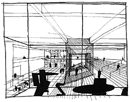
From the submission by Rafael Viñoly |
of the original building, an interior stair, and a large auditorium in the
basement. But the architects were otherwise given a free hand to alter as
much -- or as little -- as they wanted. According to the museum's director,
Glenn D. Lowry, the goal of the competition was nothing less than "to
conceptualize a modern museum in the context of the future."
In April the museum announced that Herzog and De Meuron, Tschumi, and Taniguchi
had been chosen to proceed to the next phase of the competition. The winner
is expected to be announced by the end of the year. The ten initial proposals
were displayed in one of the museum's fourth-floor architecture-and-design
galleries, in an exhibit titled "Toward the New Museum of Modern Art" --
a self-conscious reference to Le Corbusier's great modernist manifesto of
the 1920s. "Towards a New Architecture" was a call to arms full of slogans
and stirring photographs of ocean liners, airplanes, and factories. The tract
was more about the image of modernism than about the practical realities
of building -- which, of course, is why it was so effective.
THERE was not much passion in evidence at the Modern.
Most of the entrants seem to have concentrated their energy on the complicated
but mundane task of shoehorning additional space into the narrow site between
53rd and 54th Streets. Herzog and De Meuron pragmatically illustrated two
alternatives that they confusingly called "agglomerate" and "conglomerate."
Bernard Tschumi, a Swiss-French architect who is currently the dean of
architecture at Columbia University, is best known for the Parc de la Villette,
in Paris, which is generally considered one of the first built examples of
architectural deconstructivism. Yet his entry had none of the jagged edges
and odd angles that characterize that eccentric approach. Instead his sketches
showed a sort of choreography -- slide the entrance lobby over here, push
the new galleries up there, slip in the curatorial offices. This was architecture
as a Rubik's Cube. It looked competent, but I soon lost track of its
permutations. At fifty-nine, Yoshio Taniguchi was the senior competitor,
and his skillful planning was workmanlike even if his actual design was hard
to pin down.
 |
From the submission by Bernard Tschumi |
Steven Holl's project was more sculptural, but his crude sketches were
unconvincing. Williams and Tsien showed several hurriedly drawn sections
and plans, but it was unclear exactly what these added up to. Toyo Ito described
his building as both a "lying down skyscraper" and a "Bar[r] code," which
was an obscure reference to the Modern's first director, Alfred Barr Jr.
Wiel Arets included a series of thumbnail sketches illustrating what a museumgoer
would experience; the generic views included a lot of stairs and ramps. It
could have been any building, anywhere.
The people around me at the exhibit appeared to be looking intently at the
sketches displayed in the vitrines. What did they see that I didn't? Were
they, like me, looking not at something but for something --
inspiration, maybe?
The competition had required that the entire set of drawings for each entry
fit into a small flat box, eleven inches by seventeen inches. As I peered
at the sketches, it seemed to me that this salutary attempt to prevent the
entrants from overwhelming the jury with elaborate presentations had backfired.
Neo-modernist architecture relies for its effect on unadorned surfaces, large
sheets of glass, articulated details, and attenuated structural supports.
Transparency, precision, delicacy, and
 |
From the submission by Yoshio Taniguch |
abstraction are qualities that are difficult if not impossible to convey
in small, rough sketches; large, precise drawings, or better still models,
are required. So the materials in the vitrines did not communicate much about
their makers' intentions. This problem was compounded by the reluctance of
most entrants to commit themselves to any specific architectural image. The
results were more like organizational diagrams than architectural designs.
Two architects from whom one might have expected a grand gesture are Rafael
Viñoly and Dominique Perrault. In 1989 Viñoly won an international
competition for a $1.5 billion convention and performing-arts center in Tokyo
-- a dramatic, monumental building with vertiginous glass lobbies and bold
structural effects. Viñoly is a pragmatic modernist of the
knock-your-socks-off school of design. Unlike some of the other competitors,
he is also an accomplished draftsman. Yet here he seemed to be at a loss
as to what to do on the cramped, hemmed-in site. Perrault is the architect
of the controversial National Library of France, in Paris, a grand
projet if ever there was one. Parisian wags, paying homage to the engineering
of the TGV train, have christened it the TGB -- "très grande
bibliothèque." Perrault did his best with the Modern. He suggested
a huge two-floor bridge the full length of the site, flying over the sculpture
garden.
I had the feeling that Perrault's très grand musée would
have been out of place in New York. That was also true of many of the other
entries, which simply looked like they would be too tasteful to survive the
gritty free-for-all that is midtown Manhattan.
 |
| From the submission by Wiel Arets |
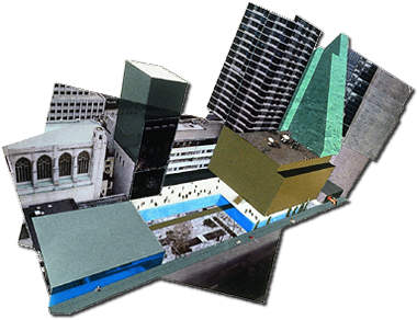
The one proposal that might have fit in was that of Rem Koolhaas, who was
not among the finalists. Koolhaas is Dutch, but his sensibility is American;
he once wrote a book titled Delirious New York. His entry in the exhibit
consisted largely of collages of photographs and magazine illustrations,
rather than drawings. It looked pretty sloppy; some of the pictures were
already starting to curl at the edges. But Koolhaas is a serious designer,
best known for his bold and often extremely large buildings, including the
Chunnel terminal in Lille, France; recently he was hired to design the master
plan for MCA's Universal City complex in Los Angeles. His approach to
architecture is a curious blend of elitism and populism. This impertinent
proposal for the Modern submerged the sculpture garden to basement level,
added a seven-story office tower -- which Koolhaas called MoMA, Inc. -- on
top of an existing building, and created a new multi-purpose space that could
house a variety of museum events. Across from this so-called forum was a
block housing new galleries, and above that a wedge-shaped tower. Instead
of escalators and elevators a newfangled movement system -- a sort of funicular
-- connected the galleries. Koolhaas's visual representation of his proposal
was easier for me to understand than those of the other entrants. The colorful
collage showed a syncopated composition of big boxes -- Good Design meets
The Home Depot.
KOOLHAAS'S proposal was a real effort to shake up the
museum: to keep the Modern modern. "Theoretically, MoMA is about newness,"
he wrote in an accompanying text. "Newness is ambiguous. It cannot last;
it cannot have a tradition." Koolhaas's bravura design was striking, but
he had confused modernism with newness. Modernism does have a tradition --
a rather long one, in fact. It was an evangelical, utopian, simplifying (some
would say simpleminded) moment in history -- and it has passed. It is, in
Robert Hughes's pithy phrase, "the future that was." Shaking things up, as
Koolhaas proposed, will not re-create it. Nor will any amount of the minimal,
austere, and functionalist architecture that the Modern seems intent on
building.
Indeed, there is something wrongheaded about the very idea of "making over"
the Modern. For almost sixty years the museum has grown in fits and starts.
The sculpture garden was added in 1953, a lobby, two wings, and an enlarged
garden in 1964, and the glazed garden hall and additional galleries in 1984.
With the possible exception of the garden, none of this architecture is
particularly distinguished. (This has not prevented the Modern from becoming
the premier museum of its kind.) The most that can be said about the varied
bits and pieces is that they reflect their different times: the white box
of the idealistic thirties, the perfect Miesian garden of the fifties, the
curtain walls of the self-assured sixties, and the atrium of the pragmatic
eighties. For better or worse, this clumsy patchwork embodies the ebb and
flow of modernism itself. If we must have austere minimalism in the nineties,
then let it take its place alongside the other styles. It, too, will pass.